
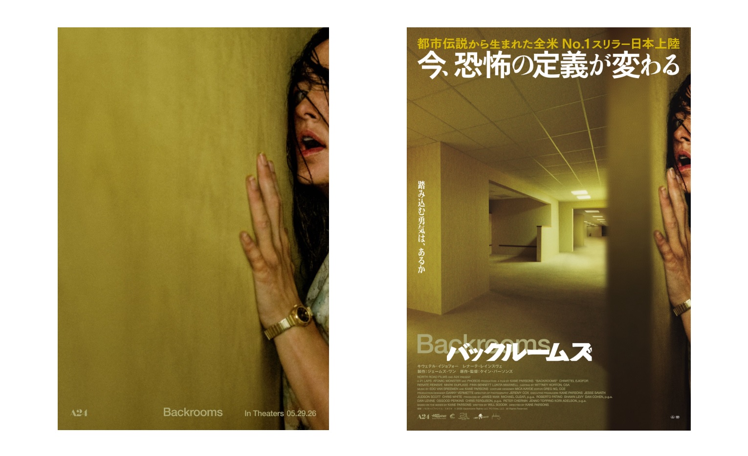
While Japanese fans won’t be able to see Kane Parsons’ Backrooms in local theaters until September 4, A24 and Japanese distributor Happinet Phantom Studios have already started marketing the movie in anticipation of its premiere. However, unlike the movie’s posters in other countries, which feature actress Renate Reinsve suffocatingly packed into a corner while most of the image is taken up by an empty, yellow wall, the Japanese poster stands out for being quite visually cluttered, and as some Japanese people on Twitter put it, “lame.”
The topic has brought attention to how many Japanese movie posters tend to follow the philosophy of “tell, don’t show” rather than the opposite. For example, promotional materials of overseas hits such as Parasite and La La Land had their subtle original designs edited in favor of more text/image-heavy and (in the case of Parasite) censored versions.
According to Japanese cultural critic, novelist, and philosopher Hiroki Azuma, this “symptom” is deeply rooted in the country’s culture and can be seen everywhere, from the lengthy titles of isekai light novels to tabloid TV programs filled with on-screen text and captions. One comment from a former film industry designer states that while designers want to make posters look cool and subtle, distribution companies are more focused on advertising everything the film has to offer and cramming in as much information as possible (this can also be seen in Backrooms’ Japanese trailer).
Given that Backrooms is a movie about liminal spaces, where the concept of emptiness creates a sense of uncanniness and dread, it’s understandable why some Japanese fans prefer the original poster design. That said, simplistic Japanese movie posters do exist. The Exit 8 movie, for instance, won the Best Poster Design award at last year’s Cannes Film Festival for its “minimalist, yet striking design.” Interestingly, that poster also positions its main protagonist against a yellow background and is likewise based on a video game focused on the concept of liminal spaces.


I mean, they’re right though, right? Unless you’re already familiar with the movie a random white girl touching a wall with a bony hand is not going to inspire a lot of Japanese people to shell out for this movie on the off chance it might be good. More information sells tickets, especially for a foreign movie in Japan.