
Written by. Nick Mosier based on the original Japanese article (original article’s publication date: 2022-03-10 14:07 JST)
A video that takes Elden Ring’s simple UI and clutters it all up is making the rounds on Reddit. Just the other day, a thread titled, “If Ubisoft developed Elden Ring” became extremely popular on the /r/Eldenring subreddit. And now we can see this video following in a similar vein.
Elden Ring is the latest action RPG from FromSoftware. The game’s user interface is relatively simple, and the User Experience (UX) also takes some considerations for the player. The game does away with quest markers and leads players through its world using geography and building design.
But while not having features like a quest log increases the immersion to some, there are other players that would like to see the game be a little more generous. The other day, a UX designer at Ubisoft posted a negative opinion about Elden Ring’s UI on social media. In what seemed like a comeback from fans, one Reddit user posted a cluttered image titled, “If Ubisoft developed Elden Ring” that blew up on the subreddit (related article). Since then, it looks like the initial context has started to fade as just having fun making Elden Ring’s UI look cluttered is starting to morph into a meme.
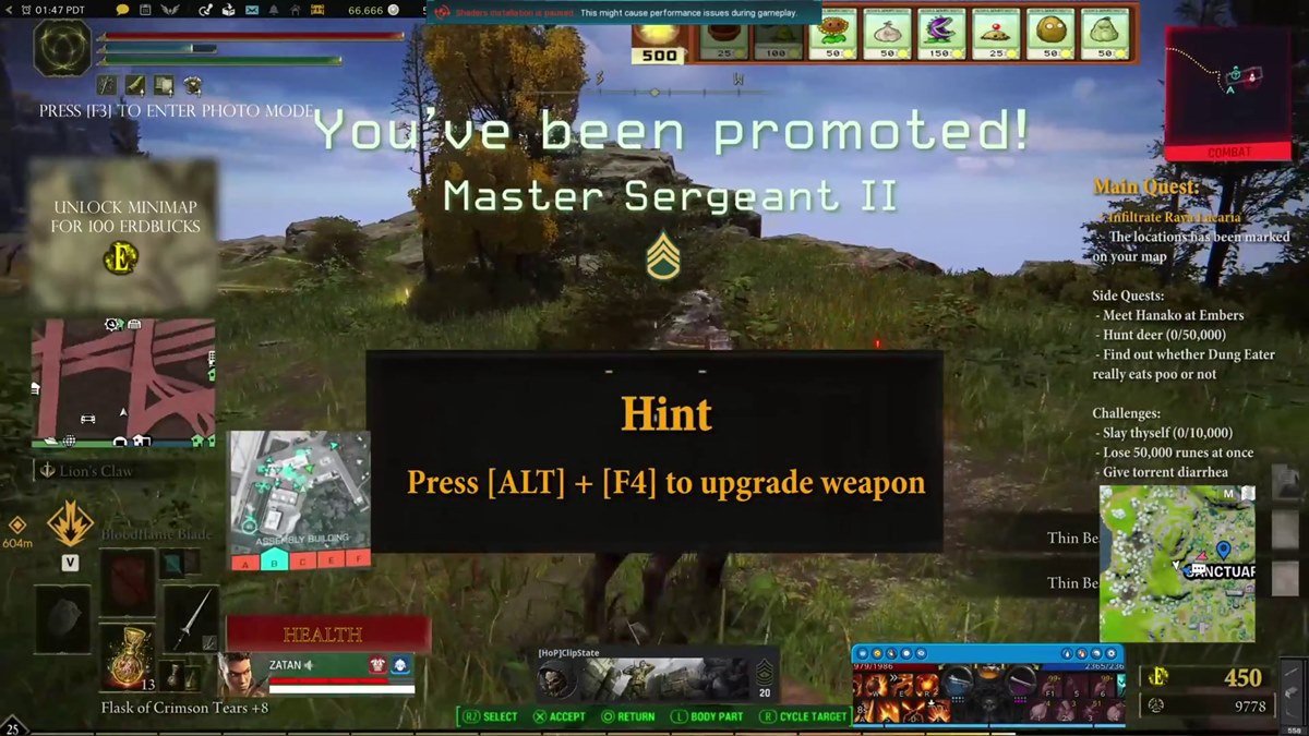
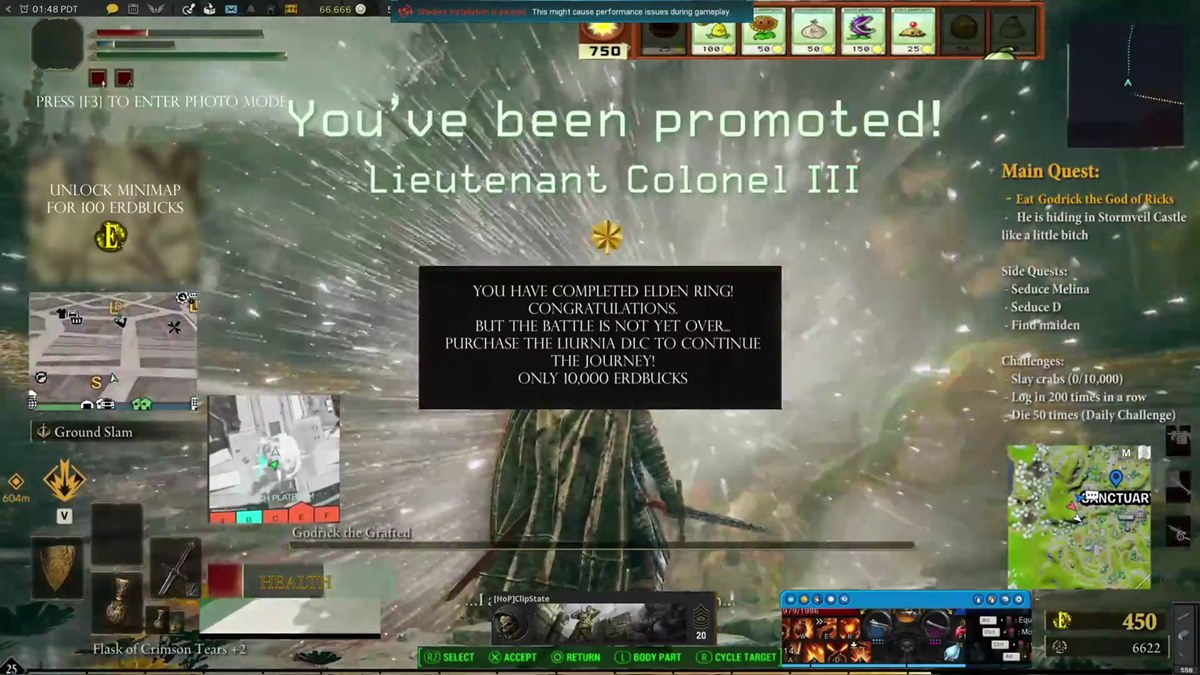
On May 9, Reddit user ClipState posted a thread with a video called, “What’s wrong Tarnished? Not gonna buy the Battle Pass?” ClipState also has a longer version on their YouTube channel. The video takes the idea behind the previously mentioned thread about Ubisoft and adds even more UI elements, sound effects, and all sorts of other eye-catching clutter.
First, there are 4 mini maps for some reason, with another that can be unlocked with 100 Erdbucks, a non-existent in-game currency they’ve come up with.
There are also UI elements from other games slapped onto the screen. More than a critique of cluttered UI, it seems more like just having fun creating something that’s totally distracting. The Bangalore icon from Apex Legends can be seen on the bottom left of the screen, while promotion sound effects and UI elements from Call of Duty appear after defeating enemies.
The video of course contains ample use of design that gamers find annoying as well. One is the giant hint box that pops up in the middle of the screen with messages like, “Buying Erdbucks can save you time! Visit the store now!” Other messages promoting microtransaction like, “Purchase Melina affection points [50] for 500 Erdbucks?” show up as well. A satirical nod to games that relentlessly promote their available in-game items and currencies.
As of this writing the thread has over 24,000 upvotes with the comments full of users riffing on the idea with their own jokes. Many have taken notice of the microtransaction messages adding, “it’s so you can buy some Erdkeys to open exciting Erdchests,” and, “the purchase advertisements should default to ‘yes’ so you might accidentally click them.”
One reason fans are likely having fun making mockups of Elden Ring’s UI is because in reality it’s simple and doesn’t have microtransactions. Adding all sorts of monetization elements and such to the design seems to be amusing for many of the Tarnished on social media and Reddit. It seems possible we’ll see even more of these kinds of images and videos in the future.