Japanese users started noticing the appearance of an alternate YouTube logo on the YouTube site and apps on August 16. The unexpected font of the new logo has caused a variety of reactions on Japanese X (formerly Twitter), with many agreeing that it is reminiscent of lame logo T-shirts worn by edgy teenagers back in the day.
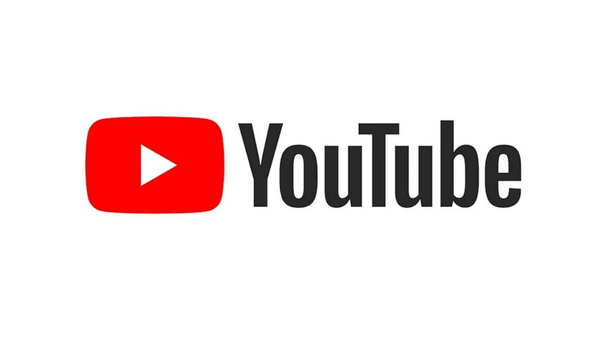
Next to YouTube’s familiar play button logo stands the name “YouTube” in a simple, bold typeface. This is normally the case, but users of YouTube Japan have started noticing that upon entering the site or clicking the usual logo, it gets swapped out with a new, alternate logo, which has the word YouTube written out in a strikingly different Blackletter/Gothic script font. The logo transitions with an animation of the letters being written out in a calligraphic manner.

But what caused the appearance of the alternate logo? Hovering over the new YouTube logo reveals the tag “Stroke of Genius,” and clicking on it leads you to a featured YouTube playlist by the official “YouTube Japan” channel. The description of the playlist reads “Join calligraphy creators as they showcase the visually compelling beauty of an age-old artform,” making it clear that it is a special feature meant to introduce the art of Japanese (when viewing the site from Japan) calligraphers.

This explains why the YouTube logo went gothic for the occasion, but this connection likely ended up “lost in translation,” as for the Japanese, calligraphy is associated with writing scripts such as kanji and hiragana, and not many will think of 書道 (jp: way of calligraphy) when they see a word written in black letter alphabet.
Having this context in mind, it’s not surprising that the new logo caused all manner of reactions from the Japanese public. Many had trouble even deciphering what the far-from-standard script even says, mistaking it for Arabic or other scripts. Those who were familiar with the font on the other hand, didn’t know of it in a “medieval European calligraphy” kind of way, but in a “that one edgy font” kind of way, causing associations with everything from rock bands and Visual Kei to Chrome Hearts apparel.
But among the various reactions, the most dominant association users have with the script seems to be “lame English logo T-shirts” worn by middle schoolers trying to look edgy, making YouTube’s logo change seem kind of funny. Perhaps the feeling is as if a popular brand suddenly used the “Cool S” in their logo.

Although the sentiments behind the logo change ended up kind of lost, it’s interesting to see that even something like a font can have such different perceptions depending on cultural background. Perhaps a happy circumstance in this story is that YouTube’s logo properly used the European equivalent of calligraphy instead of settling for one of those disturbing “faux asian fonts.”