Naoki Hamaguchi, the director of Final Fantasy VII Rebirth, has confirmed in a recent interview with Redbull that he is aware of the “yellow paint discourse” that arose among users after the release of the game’s demo. He said he will consider players’ feedback on the matter for his future works.
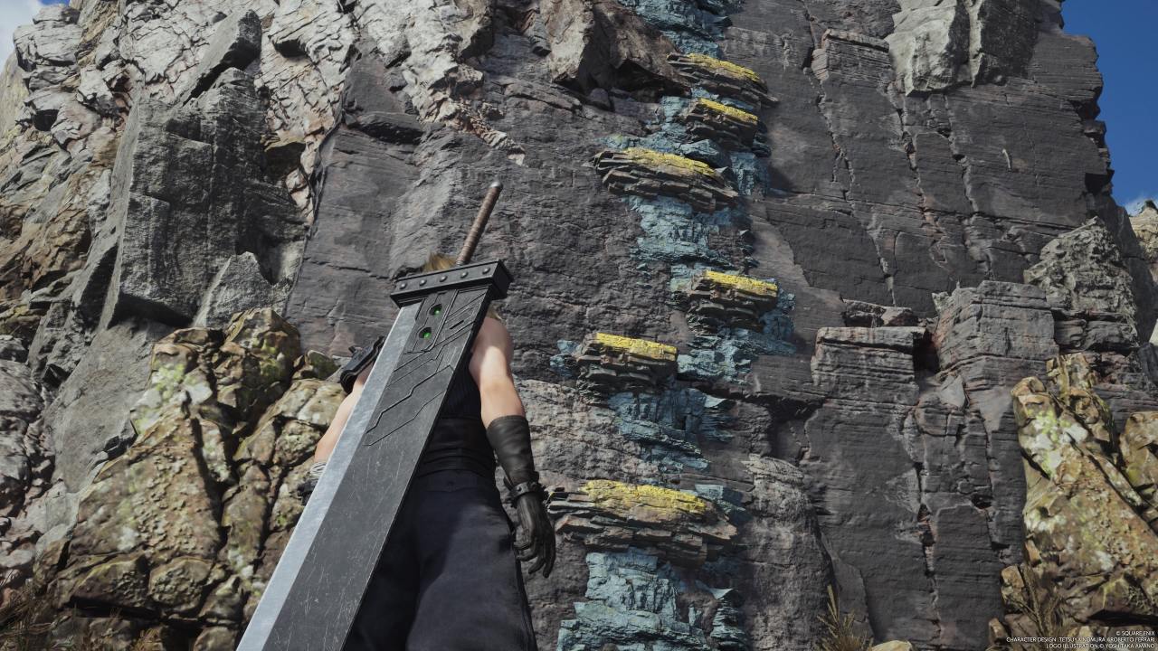
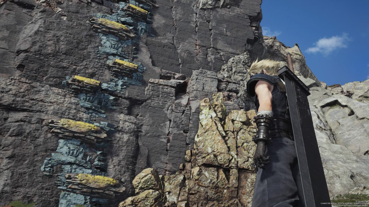
The demo for FFVII Rebirth launched in late February prior to the release of the full game, and while it was met with positive responses, it also caused some yellow-paint-related controversy. In Rebirth’s demo, yellow is used to mark the handholds that players are supposed to grab onto while climbing cliffs.
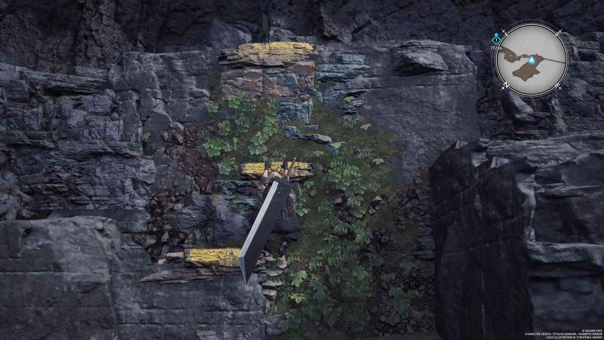
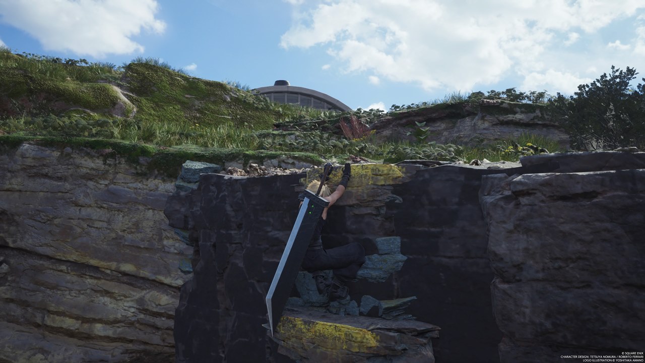
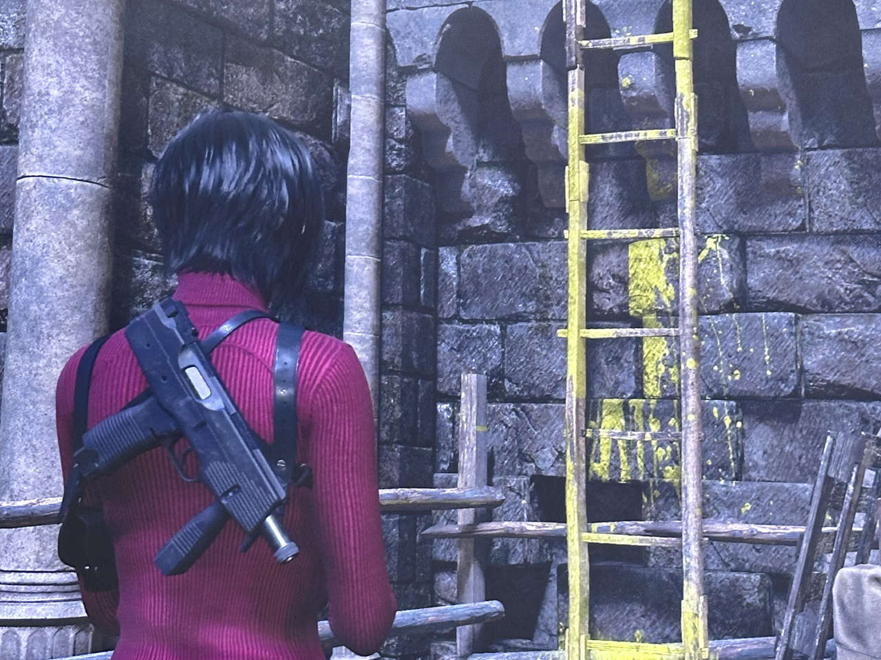
The purpose of this “yellow paint” is to make it easier to spot the right path, and while it does achieve this, it is also criticized for being too obvious and disruptive to player immersion. Opposing opinions on this specific accessibility solution had initially clashed because of Resident Evil 4, and the debate was reignited yet again with the release of FFVII Rebirth’s demo.
When asked by Red Bull about the yellow paint discourse, Rebirth’s director Hamaguchi seemed to be aware of the situation, commenting, “I didn’t think that the ‘yellow paint’ would be something that would be discussed on social media.” He then explains his view that accessibility options are a point where preferences differ greatly, similar to camera options, and that there may not be a right answer. Hamaguchi adds that the development team aims to offer a variety of accessibility options, and that they will take the “valuable feedback” they received into consideration for future games.
While acknowledging the debate going on, it seems Hamaguchi opted for a neutral stance, refraining from taking a side while promising to listen to players’ voices. There have been many requests for an on/off toggle for the yellow paint, so perhaps Hamaguchi is talking about this kind of feedback. In either case, we’re looking forward to seeing Hamaguchi’s answer to the yellow-paint issue in his next title.
Incidentally, the yellow paint seen in the full version of FFVII Rebirth is used slightly differently than in the demo version. The yellow paint in the demo is used to indicate all the climbable handholds on cliffs along the single main path up Mt. Nibel. Although it may seem annoying to experienced players, the paint was probably used heavily in Chapter 1 to help ease new players into the game.
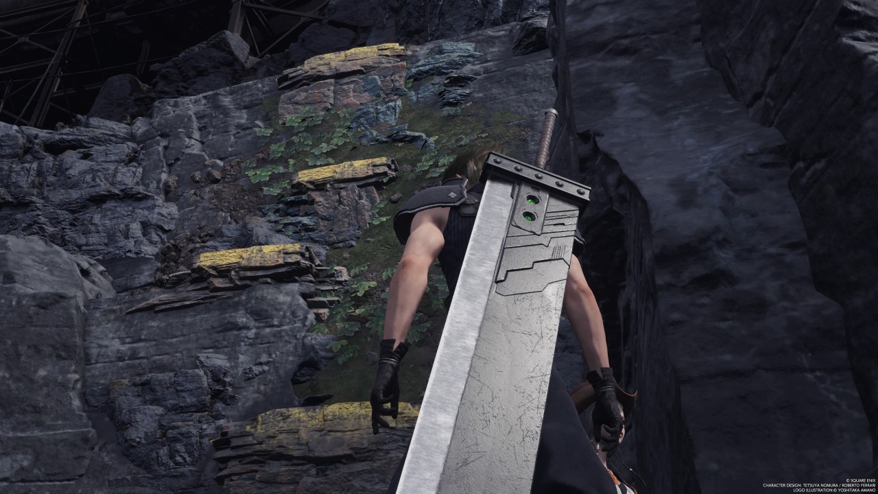
On the other hand, the full game uses yellow paint and other markers to indicate “detour routes” as well, guiding players to less obvious spots such as Intel Locations. These methods play a more important role than the yellow paint that marks the main path up Mount Nibel, as without such guidance in the open world areas, it would be difficult to tell that there is a path at all. In this sense, the yellow paint is more of a means for helping players find paths rather than a means of guiding players along a single path. Another guidance method in Final Fantasy Rebirth is the Ghost of Tsushima-style use of birds to lead you to points of interest (Related Article).
Furthermore, in the main storyline, there are areas where the yellow paint is nonexistent or difficult to see, making it difficult to find the way. The yellow paint is not consistently utilized, which may be confusing to some players.
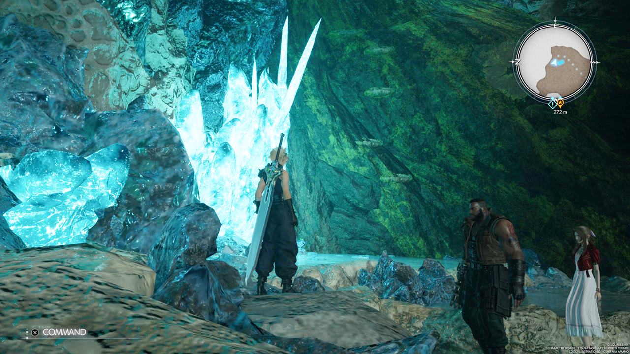
Although a simple solution, yellow paint is quite versatile as an accessibility option, as it can be used to help players discover paths as well as to lead them along existing ones. Also, there are certainly situations where the absence of yellow paint (or an equivalent) creates confusion. As Hamaguchi implied, it may not be a simple question of whether you want it or not, but something that requires more thoughtful consideration.
Final Fantasy VII Rebirth is available for the PS5.
Written by. Amber V based on the original Japanese article (original article’s publication date: 2024-03-13 13:35 JST)



An option means that it’s optional. Not getting the chance to disable it is why people are complaining.
I will say this is due to hyper realistic games as a whole being difficult to know where anything is due to the fact there is no style to help make certain important objects stand out. So they have to resort to this.
The best middle ground in my opinion is to make the textures different colors to show what you can interact with as a whole if it’s sections that gamers can be confused with as a whole.