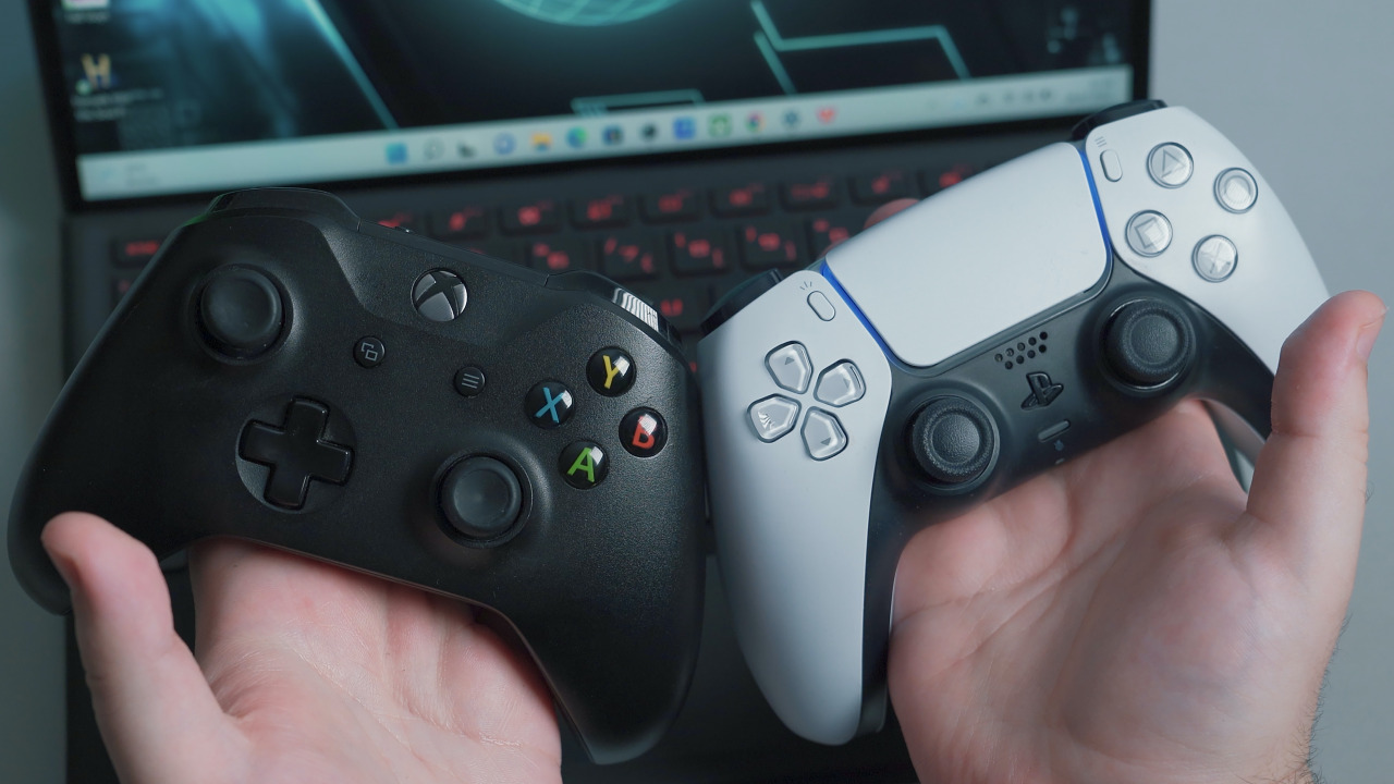
The shapes of game controllers differ depending on the console they are for or the company that designs them. And although some share certain buttons or have similar layouts, the face buttons on the right of controllers often feature different notations or placement. Some on social media have suggested that these four buttons should be based on the four cardinal directions (North, East, South, and West) and labeled N, E, S, and W accordingly. The idea has seen a wealth of support, likely with respect to how it would make the button layout easier to understand and more intuitive.
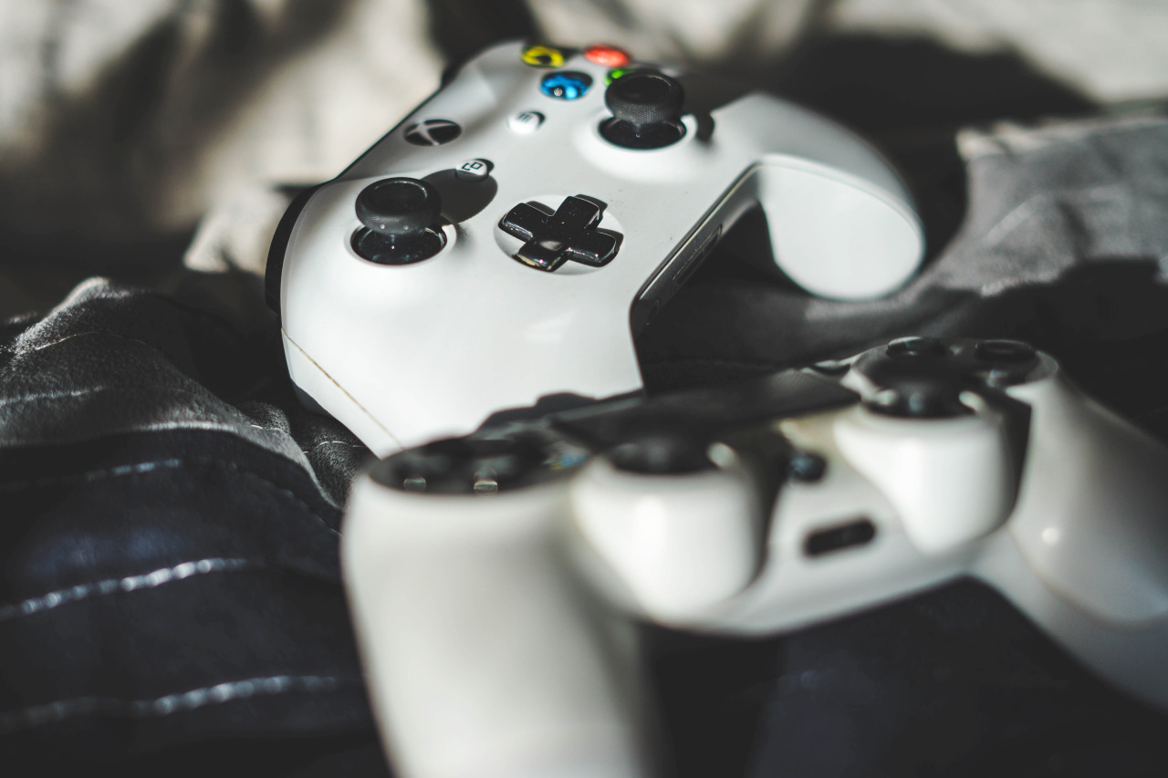
The discussion on social media surrounding the notations featured on controller face buttons has recently become a heated affair. Things began with a post that showed the face button layouts of the PlayStation and Xbox controllers and posed the question: Which one is right? In response to this tweet, another user noted that, setting the initial question aside, Nintendo and Xbox may need to have a discussion regarding their respective face button layouts. Both companies use the A, B, X, Y notation for the face buttons on their controllers, with A and B on the lower right, and X and Y on the upper left, but placement of the two buttons are reversed in each case. The intention of the tweet was no doubt to highlight just how confusing this can be. The discussion of which face button layout is “correct” has continued to gather attention and is overflowing with enthusiasm.
One user mentioned a potential solution to the problem that they had previously come across and many considered it to be rather ingenious: label the face buttons after the four cardinal directions. The buttons would be labeled N, E, S, W, with N in the north (top) position, E in the east (right) position, S in the south (bottom) position, and W in the west (left) position. Since this directional system is used worldwide, it is well known and would help players intuitively understand the locations of the face buttons regardless of country and culture. Many users expressed praise for the idea, while others shared a diverse range of their own opinions.
One of the factors that may be fueling this lively debate is the fact that face button layouts have differed for so many years and been a source of prolonged confusion among gamers. Nintendo’s current console, the Nintendo Switch, has a face button layout of X, A, B, Y (clockwise starting from the top), but this layout is simply the same one that Nintendo used for the Super Nintendo, which was first released in 1990. While Nintendo has used varying layouts across the consoles in between, they have generally always placed A to the right of B, and X to the right of Y.
On the other hand, Microsoft has stuck with the same face button layout ever since launching the original Xbox console in 2001. As mentioned previously, the layout is similar to Nintendo’s but with the positions of A swapped with B and X swapped with Y. There’s also Sony Interactive Entertainment’s PlayStation consoles, which were mentioned in the original tweet and have used the △○□× layout in each generation. The controllers of the three major gaming platforms each have their own unique differences in layout, and this can feel especially confusing to those who play games on multiple consoles.
There are some games that take this potential confusion into account and include some sort of guidance to help players know which button they need to push. One example is The Legend of Zelda: Tears of the Kingdom. In that game, players must use the A button (located on the right) when they wish to pick up items. When the game wants to instruct you to press this button, not only does it display the A button on screen, but it also shows the A button’s position relative to the other face buttons. This seemingly minor feature helps players intuitively distinguish which button they need to press.
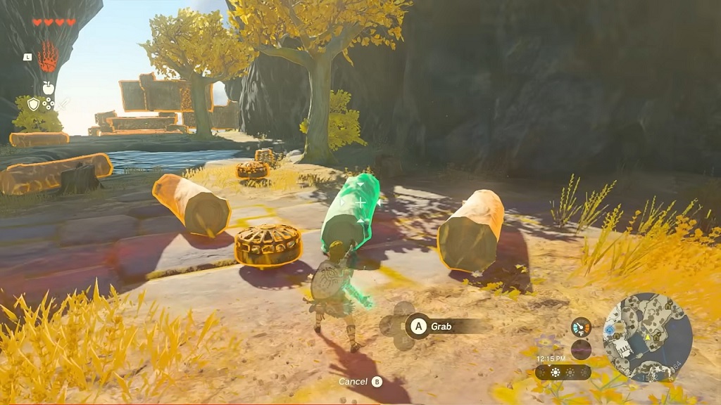
Other games also feature similar considerations that attempt to avoid creating confusion for players. In addition to showing buttons on the in-game UI, like in Tears of the Kingdom, some PC games even let players change the in-game button layouts to mimic either the PlayStation or Xbox style. However, this function is not available in all games, and while it certainly helps players who are accustomed to either of the consoles, those who play on multiple consoles on a regular basis will likely still go through the confusion different layouts bring.
The debate surrounding controller face button layouts is one that many gamers who have long been perplexed by these layouts can surely sympathize with. This may also be why these discussions are so spirited. Of course, the design philosophy behind each controller varies depending on the platform, and the idea that they would all adopt a unified layout is unrealistic. Having said that, there is no doubt that many gamers are hoping for a consistent face button layout at the very least.
Written by. Marco Farinaccia based on the original Japanese article (original article’s publication date: 2023-08-17 18:13 JST)

