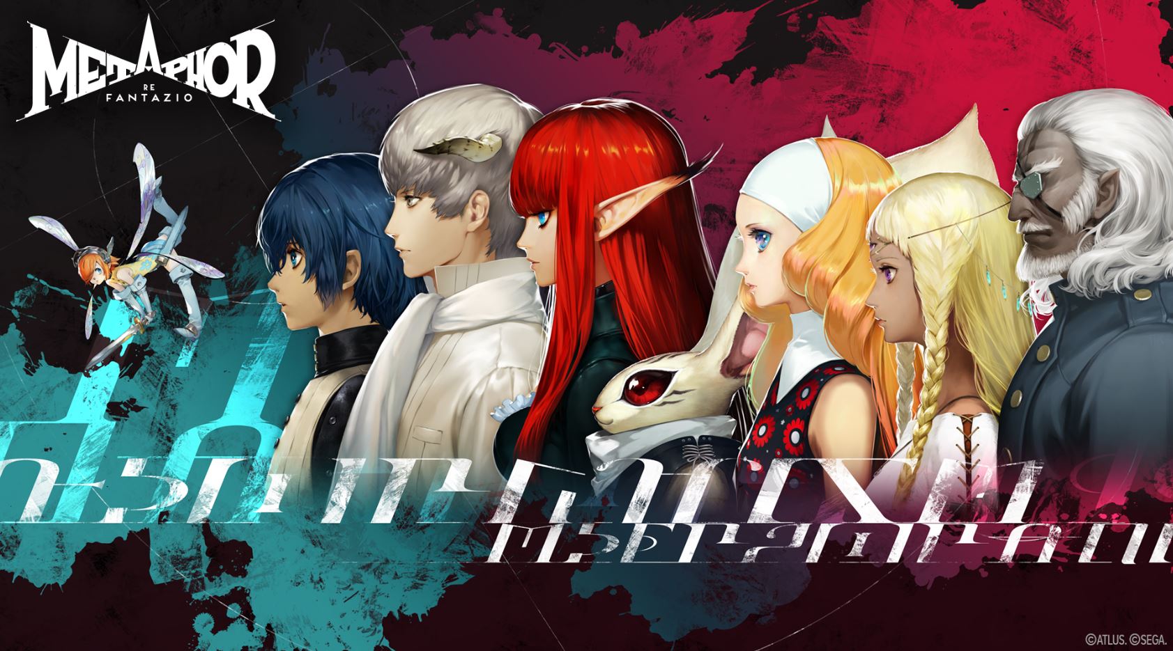
Shigenori Soejima, the art director and character designer of the Persona series and Metaphor: ReFantazio, recently participated in a three-way discussion with Denfaminicogamer and former Atlus designer LAM. During the conversation, the two creators were asked about what makes the character designs of Persona and Metaphor so memorable, prompting some interesting observations from LAM.
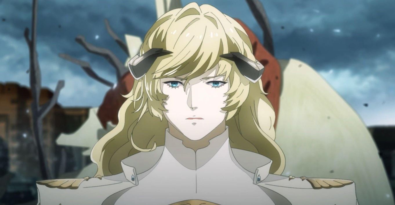
For context, LAM is an independent illustrator who worked for Atlus for five years and was involved in the graphics and UI designs for Shin Megami Tensei, Soul Hackers 2, Etrian Odyssey and Persona 5. He joined Atlus after encountering Persona 3 as a teenager and becoming lovestruck by Soejima’s art style.
When asked by Denfaminicogamer about what makes Soejima’s character designs so compelling, LAM says, “In a word, it’s sex appeal. When I saw Soejima’s character designs, it was the first time I found male characters sexy. That goes especially for Yu Narukami in Persona 4 and Joker in Persona 5. When I saw Joker, I remember thinking about how sexy he was.”
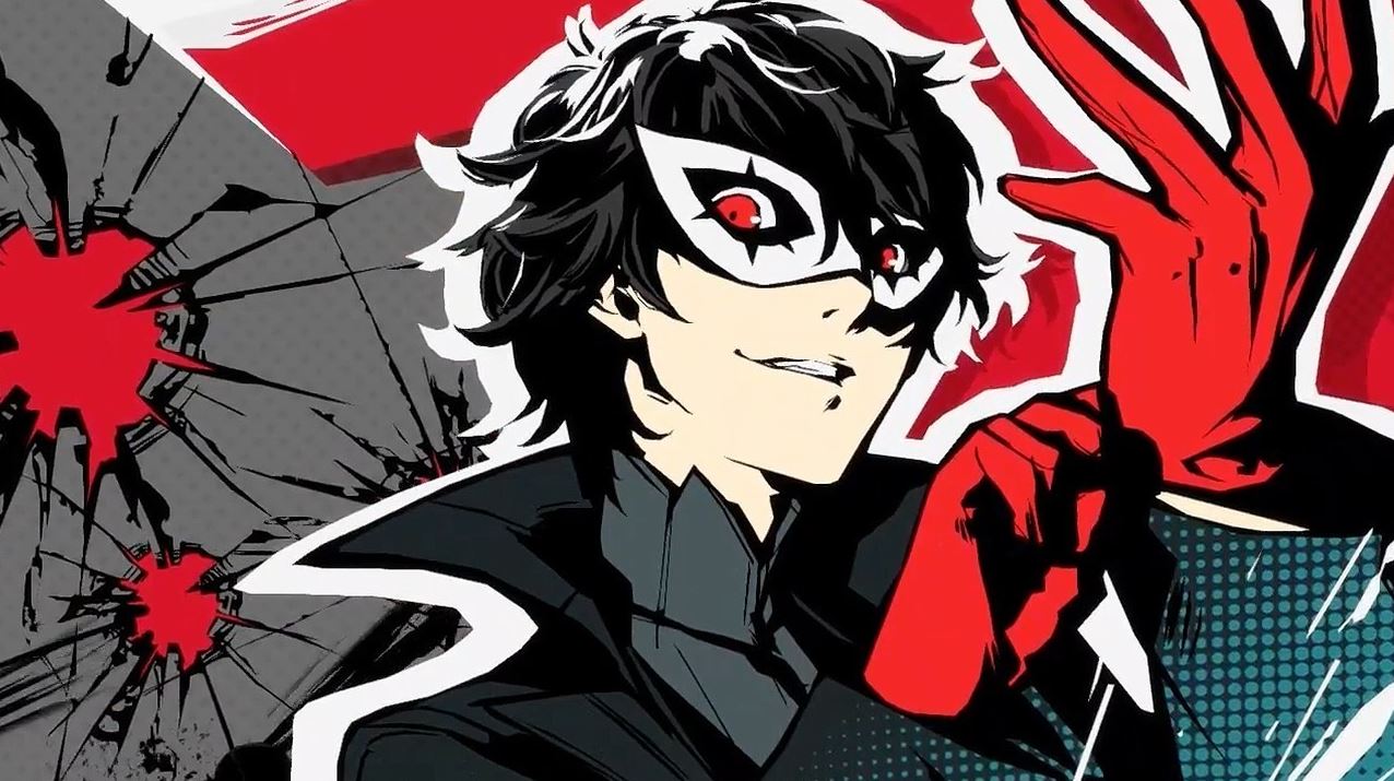
LAM goes on to call Soejima a “genius character designer,” highlighting his subtractive approach to design that condenses visual elements of a character in a way that makes them memorable at a single glance. He gives the example of Persona 5’s Ren Amamiya, who is immediately recognizable by his black, unruly hair and glasses, as well as Metaphor ReFantazio’s Gallica, who wears a simple tricolor palette and signature headband.
Returning to the topic of sex appeal, LAM comments, “In a good way, [the character design] feels “unisex,” in the sense that you can’t tell the author’s gender. It might not be so good to say in this day and age, but I think that artists can display bias in how they depict the opposite sex. You have artists who draw women in a cute way, and you have artists who draw men in a cool way.”
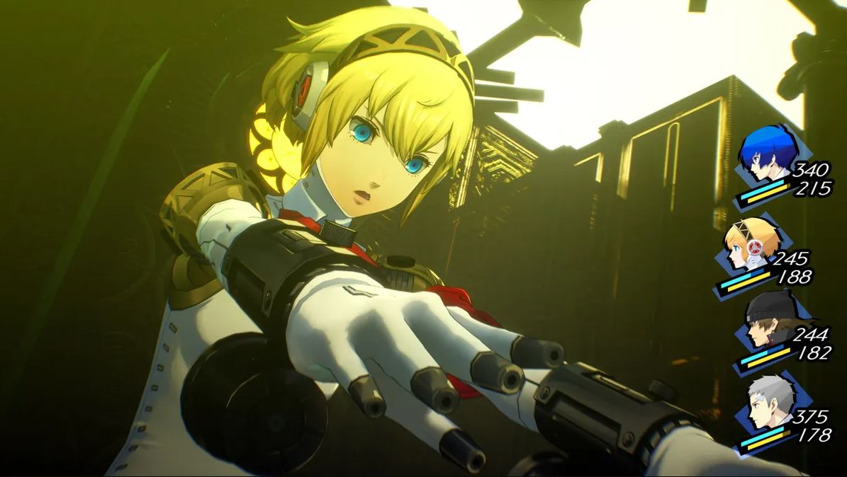
But according to LAM, such bias cannot be detected from Atlus’s Soejima. “With Soejima, it’s like he’s looking at the characters from a bird’s-eye view. There’s no difference in the attractiveness of the characters depending on gender. They’re beautiful and cool regardless of age and gender.”
In response to this observation, Soejima chimes in to explain that his distanced, equal treatment of male and female character designs comes from him being conscious of the Persona series’ fan base. “Obviously, there are many male Persona fans, but there are also many female fans. That’s why I think it’s important to draw female characters in a way that won’t be disliked by female fans. After all I’m, a guy myself, so I do get the urge to draw cliched bishōjo from time to time, but still, I place an importance on this approach.”
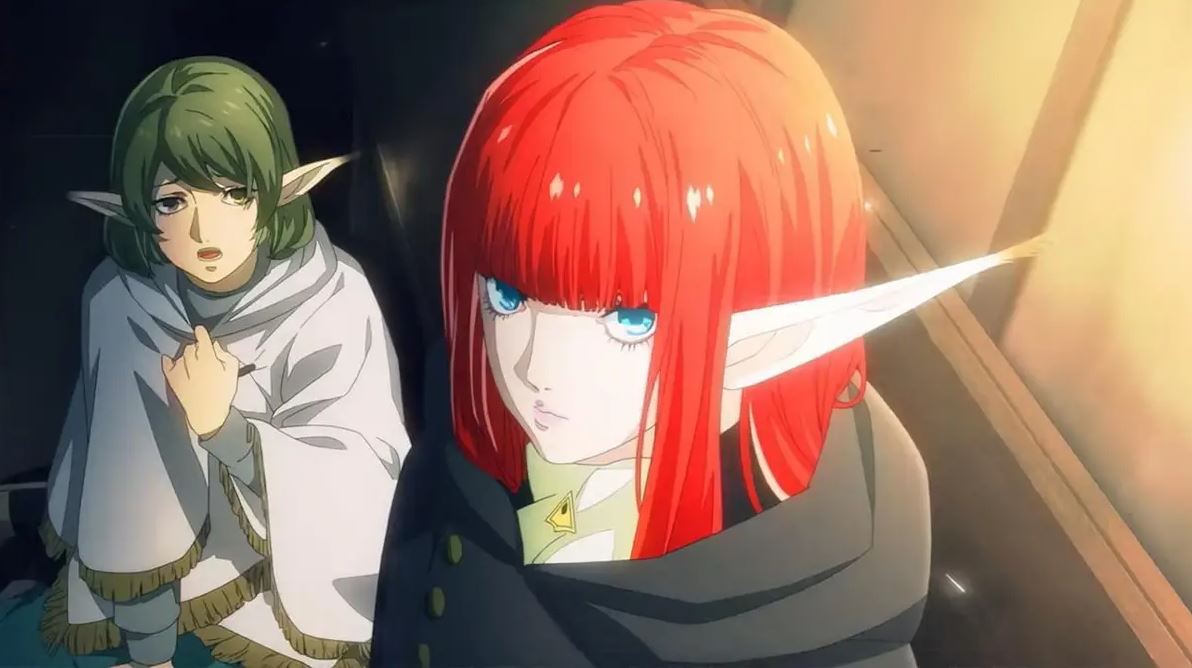
According to LAM, while Soejima drafts his character designs, he flexibly consults with other staff members, including asking female team members for feedback on his female character designs. On the other hand, he doesn’t hesitate to add his personal “fetishes” to his designs for Atlus games either, one of which is giving characters headbands. Apparently, Soejima loves headbands enough for it to be a running joke in the studio, and he fully embraced it when designing Metaphor: ReFantazio’s protagonist.

