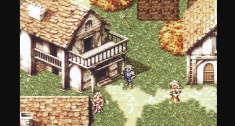
What would Final Fantasy 7 have looked like if it had continued to use 2D pixel graphics instead of 3D? To answer that question, a very early in-development image has recently resurfaced on X, quickly attracting over 7000 retweets. Even Final Fantasy 7’s art director Yusuke Naora has responded to the post, reminiscing fondly about the early mock-up.
An FF7 like this would have been possible in an alternate timeline.
The original Final Fantasy 7 marked a significant turning point in how Square made the RPG series, as they moved from developing Final Fantasy 6 on the cartridge-based SNES to Final Fantasy 7 on the CD-based PlayStation. The graphic style moved from 2D sprites and backgrounds to 3D polygonal character models and pre-rendered backgrounds. The extra space provided by the CD-ROM format also allowed them to introduce FMV cutscenes to the series for the first time (Final fantasy series creator Hironobu Sakaguchi previously gave a detailed explanation as to why FF7 was developed for PlayStation not N64). As the first Final Fantasy with 3D graphics, Final Fantasy 7 helped push boundaries for the series at the time- with Final Fantasy 8 and 9 showcasing an even greater leap in terms of graphical realism.
The above image from the early stages of development is also interesting because it looks a little like Nibelheim or Kalm in terms of the style of the buildings. Eagle-eyed viewers will also notice that one of the sprites is a reworked version of Locke from Final Fantasy 6. It seems likely that this was a mock-up made when Final Fantasy 7 was going to be on the Nintendo 64. It sounds like Naora and the team were gearing up for the extra space and technical capabilities offered by the N64 compared to the SNES (which FF6 had been on). Instead, they ended up making Final Fantasy 7 for the PlayStation- which gave them even more memory to play with.
Another X user contributed a further magazine page (the bottom image in the tweet above), which gives a glimpse of mock-ups for Final Fantasy 7’s Nibelheim and the battle screen after the team had switched to 3D. Interestingly, the faces of each character in your party and status effect information is displayed along the top of the battle screen- something that would be removed from the final game.
Regarding the 2D prototype, many commenters have complimented the art style- saying that they would have liked to play FF7 in this manner (Naora himself suggests that in an alternate reality, FF7 could have ended up looking like this). Such 2D graphics arguably have charm and nostalgia that has stood the test of time better than some of the early 3D character models of the 90s. Ironically, the 2D pixel artstyle has made a comeback in recent years, with many indie games opting for a pixel art look. In addition to adding extra shine to old classics like with the Final Fantasy Pixel Remaster series and the upcoming Dragon Quest 3 HD-2D Remaster, Square Enix themselves have also released many original games whose graphic style is a polished throwback to the 16-bit era – such as Octopath Traveler.
In other Final Fantasy 7-related news, Final Fantasy 7 Remake’s developers are gradually releasing more details about what we can expect from the upcoming final part, in regard to the ending and player freedom.


2D Pixel Art was phased out due to 3D because of Virtua Fighters popularity with Japan at the time which when MGS1 came out on PS1 it’s fate was sealed. But for some of Japan i had noticed they decided do a route of 2D and 3D called 2.5D, that tried to have 3D backgrounds and 2D Sprites in the front. I think back in the day the reason why it did not work out was that 3D was not as polished with it not being as stylish or had much environmental effects going on which made viewers bored over time.
Which is why 2D-HD exists today and has made the resurgence that is desperately needed to keep newer fans and older fans interested. Because it fixes the issue of the 3D portion of not being interesting and has a nice modern take of 2D JRPG gameplay.