Written by. Nick Mosier based on the original Japanese article (original article’s publication date: 2022-03-07 13:53 JST)
A mockup image of what Elden Ring’s UI might look like if it was made by Ubisoft has sparked a big discussion among fans. This image looks to be a shot at over-the-top UI from Ubisoft and made waves just as developers were sharing their opinions on Elden Ring’s UI online.
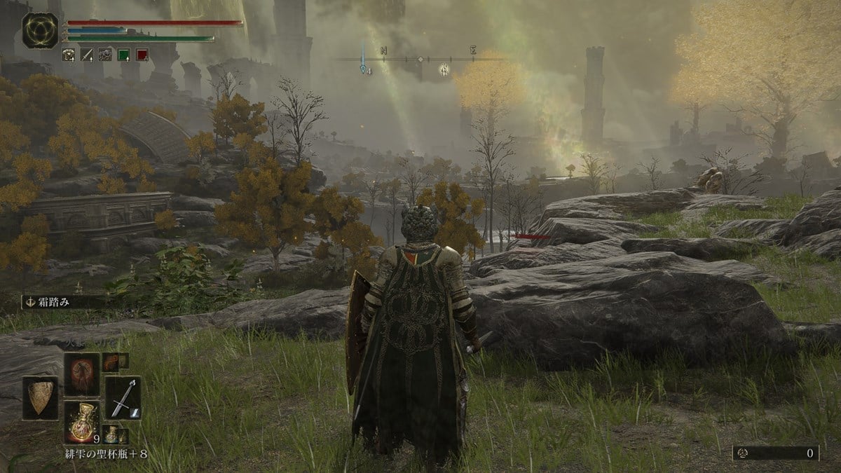
Elden Ring is the latest action RPG from FromSoftware and is set in a massive open field. The UI in Elden Ring is relatively simple. It doesn’t even have a quest log and players have to manually place markers on the map for points of interest. Players must also search for new locations and items themselves with a design philosophy that you could say respects players’ autonomy.
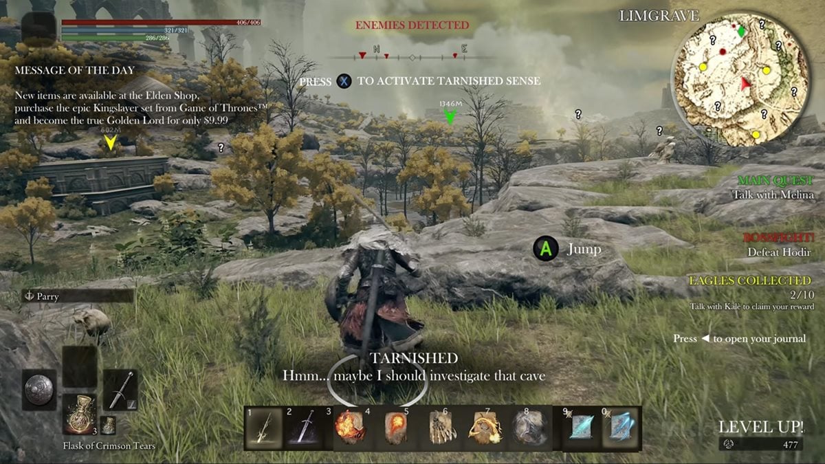
In the /r/Eldenring subreddit, an image of Elden Ring cluttered with UI elements was posted with the title “If Ubisoft developed Elden Ring,” and has since become a hot topic with over 28,000 upvotes. This post looks to have taken an image from last year called “What if Elden Ring was a typical open world? (OC)” and added even more stuff to it. It’s night and day compared to Elden Ring’s actual UI.

Image Credit: gamboozino/Phedericus on Reddit

When you look at the Reddit post, there are certainly lots of UI elements we’ve grown accustomed to seeing, but it’s a lot when compared to the actual Elden Ring. On the right side you can see quests and progress as well as a mini map. And on the left side, they added a message about microtransactions which don’t exist in the game.
There are also little hints saying, “Enemies Detected,” “A Jump,” and “Press X to activate Tarnished Sense.” It’s not a feature that exists, but the Tarnished Sense perhaps highlights enemies and items in the vicinity. We can even see the protagonist muttering, “Hmm… maybe I should investigate that cave,” which actually seems plausible. At any rate, the image takes UI elements that don’t seem so farfetched and adds them to Elden Ring for an exaggerated effect.
In the same post we can see many users happy that Elden Ring doesn’t have that kind of UI. That could be because of how the game presents visual information without relying on words and numbers. The level design is thorough in how it entices players’ eyes and actions. Just by pursuing any landmarks, buildings, or side roads that catch your eye, you’re naturally led to challenges and rewards. It abandons the idea of leading players directly with markers and steps aside so players can enjoy the fun of spontaneous adventure.
In the case of Elden Ring, we can see this design being welcomed by players and a big success. It’s interesting to see things trend toward not just making everything easy to understand for the player.

But why is Ubisoft the one being targeted? One reason could be that they release a lot of open world games. But if you look at footage of their recent title Assassin’s Creed Valhalla, the UI doesn’t really seem over the top despite having more going on compared to Elden Ring.
Another reason could be a tweet made by Ahmed Salama before the image was posted on Reddit. Salama previously worked as a UI programmer at DICE on Battlefield 2042 and is currently working as a UX director on an unannounced Ubisoft title. On March 3, Salama tweeted about how Elden Ring having a 97% Metacritic Score was proof game reviewers don’t care about UX. In other words, Salama doesn’t appear to think too highly of Elden Ring’s UI/UX design.
In response to the tweet, other developers responded by saying reviewers don’t seem concerned with stability or performance either and Horizon Forbidden West senior quest designer Blake Rebouche doesn’t seem to think too highly of the game’s quest design. These tweets ignited a big discussion on /r/Eldenring and were even picked up by media outlets like MP1st. In other words, it looks like Ubisoft may have been targeted by fans because one of their developers shared a negative opinion of the game.
Other developers and players can be seen here and there sharing negative opinions on the game’s UI and UX design, though. In Elden Ring, users are mostly left to either remember or take down notes to keep track of subquests. One Reddit user commented, “I don’t want quest markers or something walking me through every step of the quest, but some kind of log of NPCs and the conversations I’ve had with them is, in my opinion, necessary for an open world game.” Rami Ismail, a game developer known for working on titles like Nuclear Throne, also tweeted, “the UI/UX is absolutely atrocious,” when pointing out that the way the map is closed can even cause confusion.
The optimal UI and UX likely depends on the game and the philosophy behind its design. There isn’t necessarily a correct answer. Is it best to pull players along or set them free? That’s a question for the development team to answer, and players are free to accept it or not accept it as they please. However, many Elden Ring players on Reddit appear to like having minimal UI elements and no quest markers. Perhaps these discussions in the industry will bring about new methods and philosophies for giving players information in open world games.
[Update 2022/03/07 18:00 JST] adjusted a sentence in the final paragraph to be more precise.


